Packaging Launch: Perfect Bar | Ricky’s Lucky Nuts
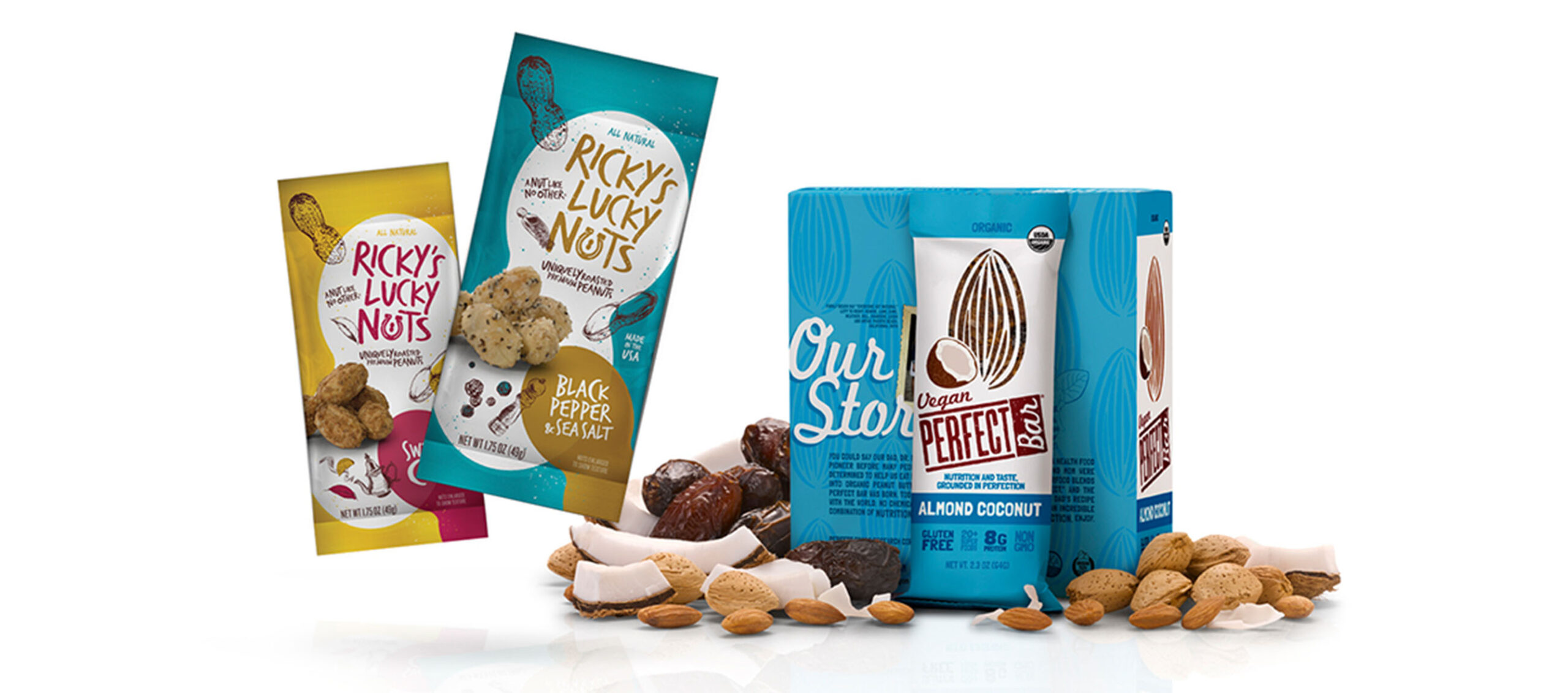
Packaging says a lot about a brand. Sometimes, what people see on shelf can be a product’s first introduction to a potential consumer. Needless to say, it has to be enticing. When two of our clients, Perfect Bar and Ricky’s Lucky Nuts, came to us wanting to freshen up their look, we jumped at the chance to add some appetite appeal to their packaging.
Perfect Bar
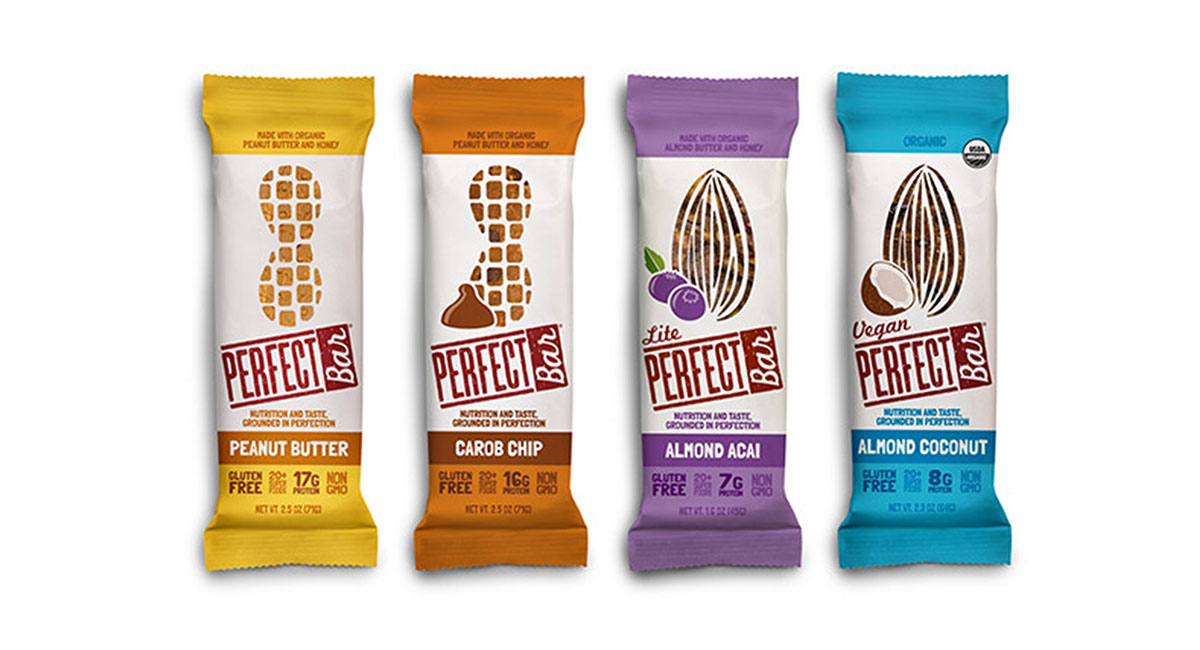
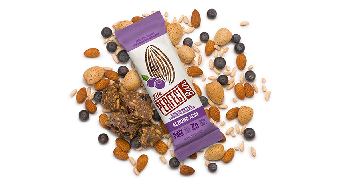
The Perfect Bar story began when a family of ten and a bunch of barbells all piled into a motor home and roamed the country for four years. During this time, a nutrition bar was born. One that was so different, you can only find it in the refrigerated section of your favorite store. Through their 7-bar package redesign, we wanted to share their unique story and show the world just how “grounded in perfection” this brand actually is. Perfect Bar’s new look has already caught the industry’s eye, and distribution numbers are quickly on the rise. Next up: an overhaul of the brand’s site.

Ricky’s Lucky Nuts
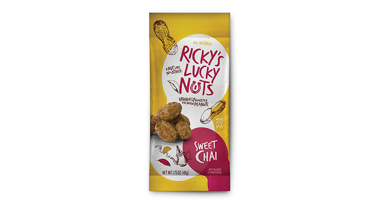
The folks over at Ricky’s Lucky Nuts got pretty lucky (pun intended) when they stumbled upon a unique process that bonds some of the world’s best flavors to their nuts. The result was a nut like no other. Yet, their current packaging didn’t do these Lucky Nuggets® justice. So we helped them revamp their look with craveable new packaging that invites more people to check out the crunchy taste sensation inside. Our redesign got them several second looks at the Winter Fancy Food Expo in San Francisco, which immediately increased their orders for 2014.
