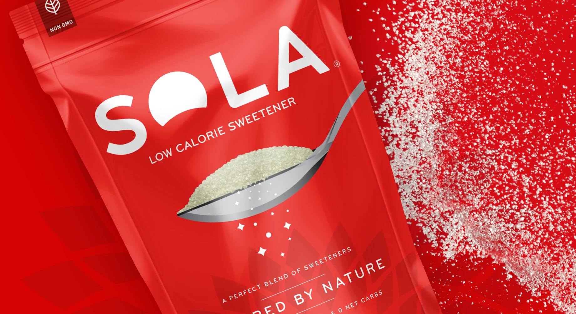
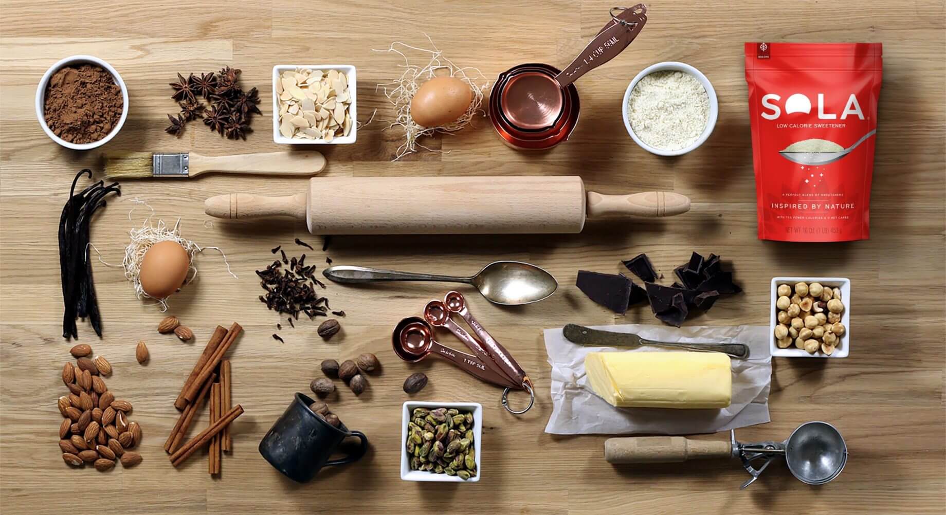
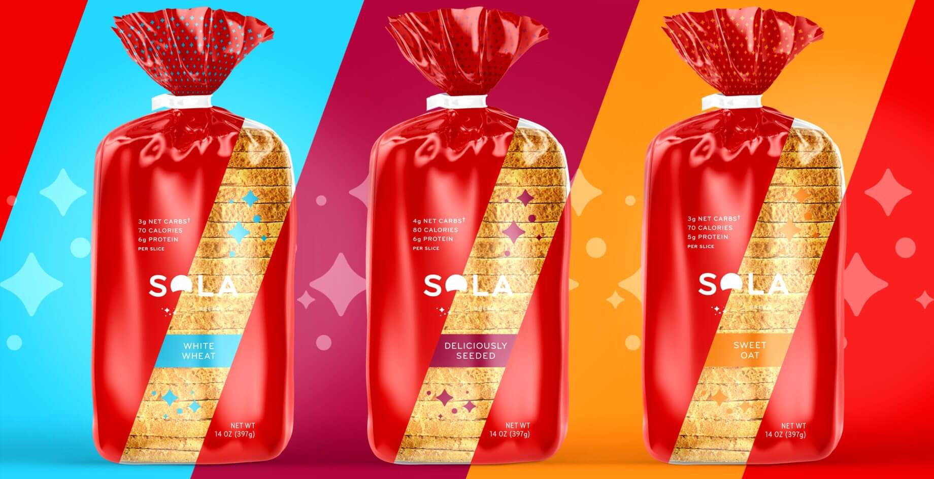
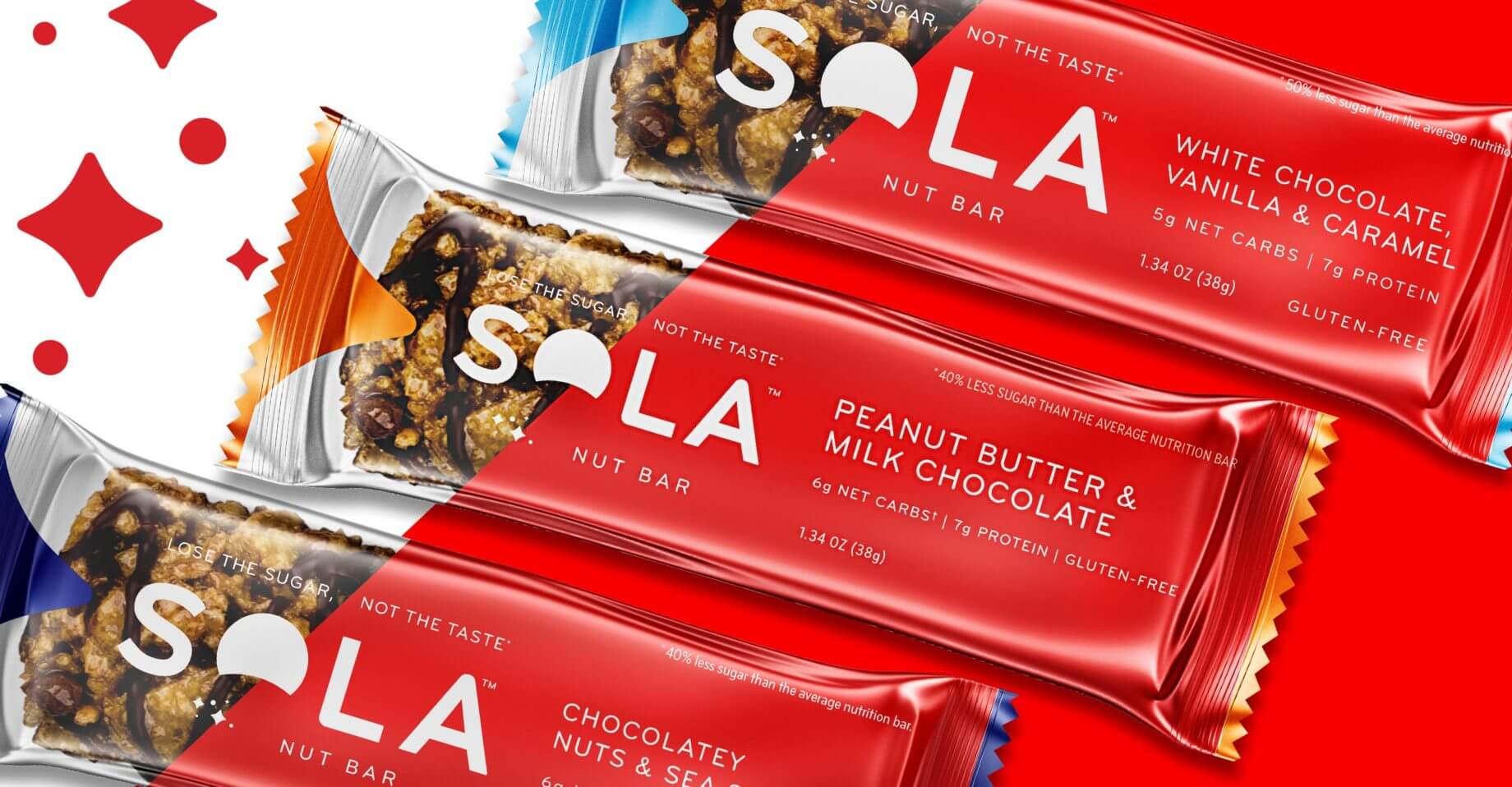
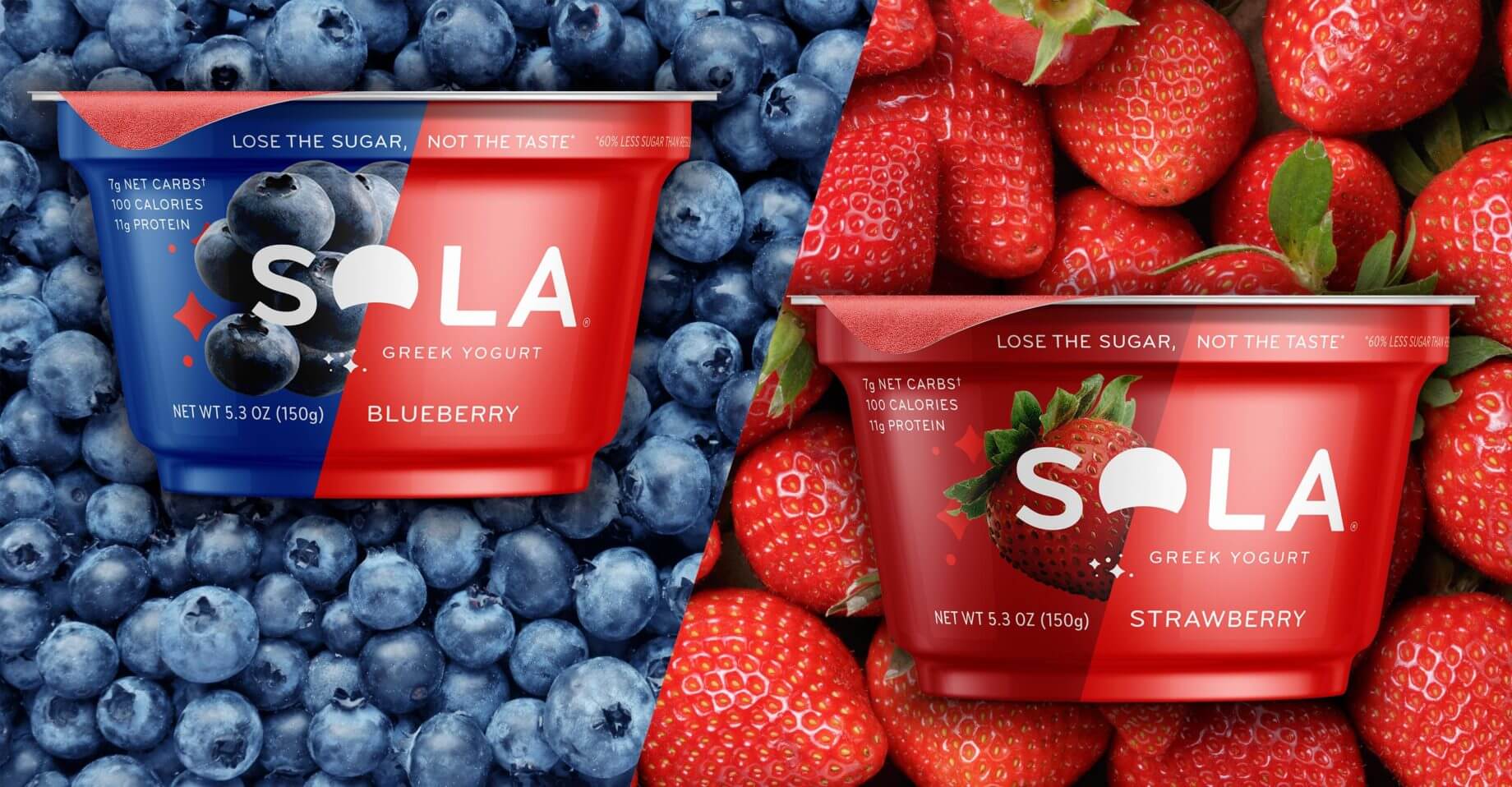
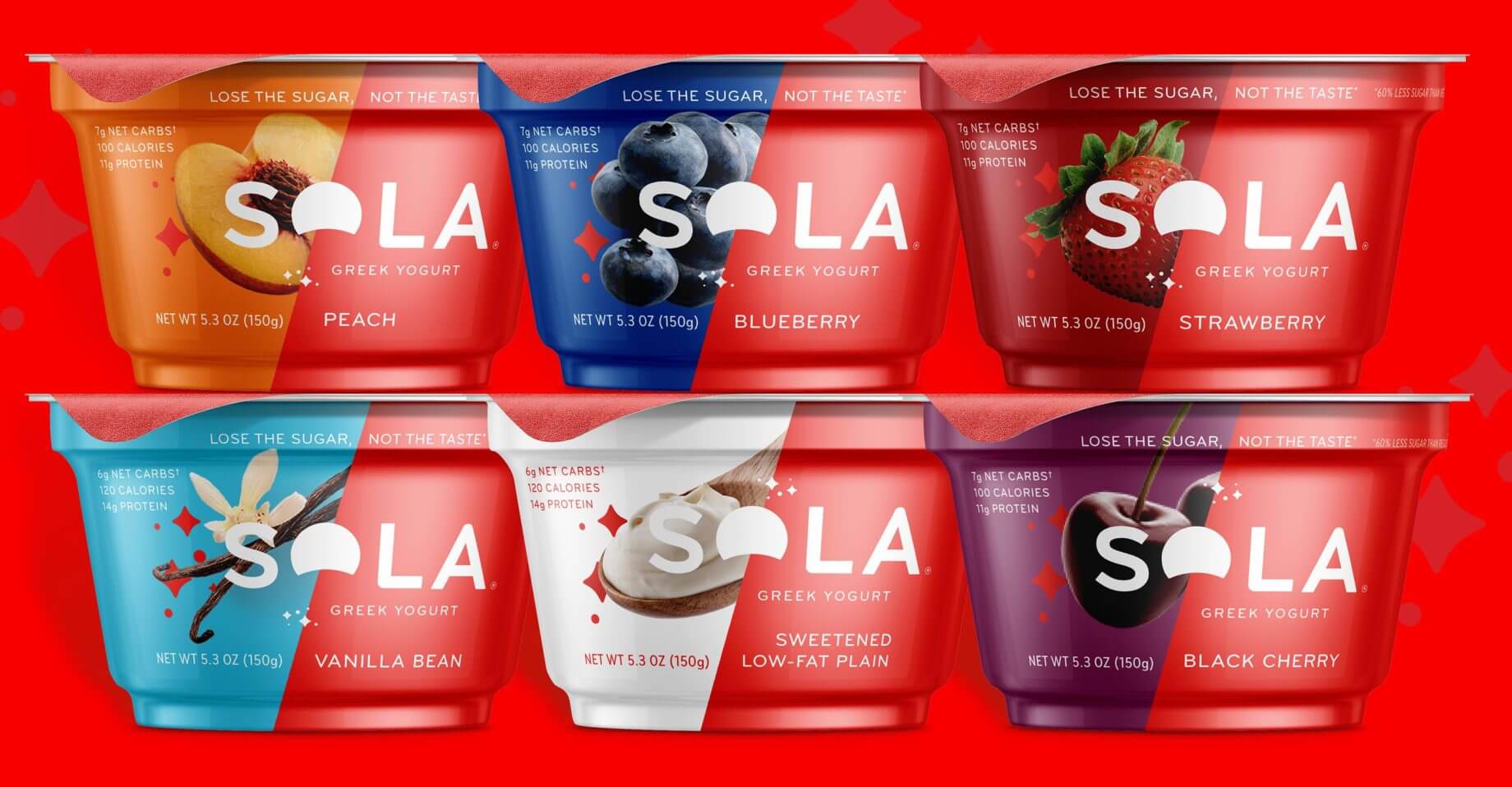
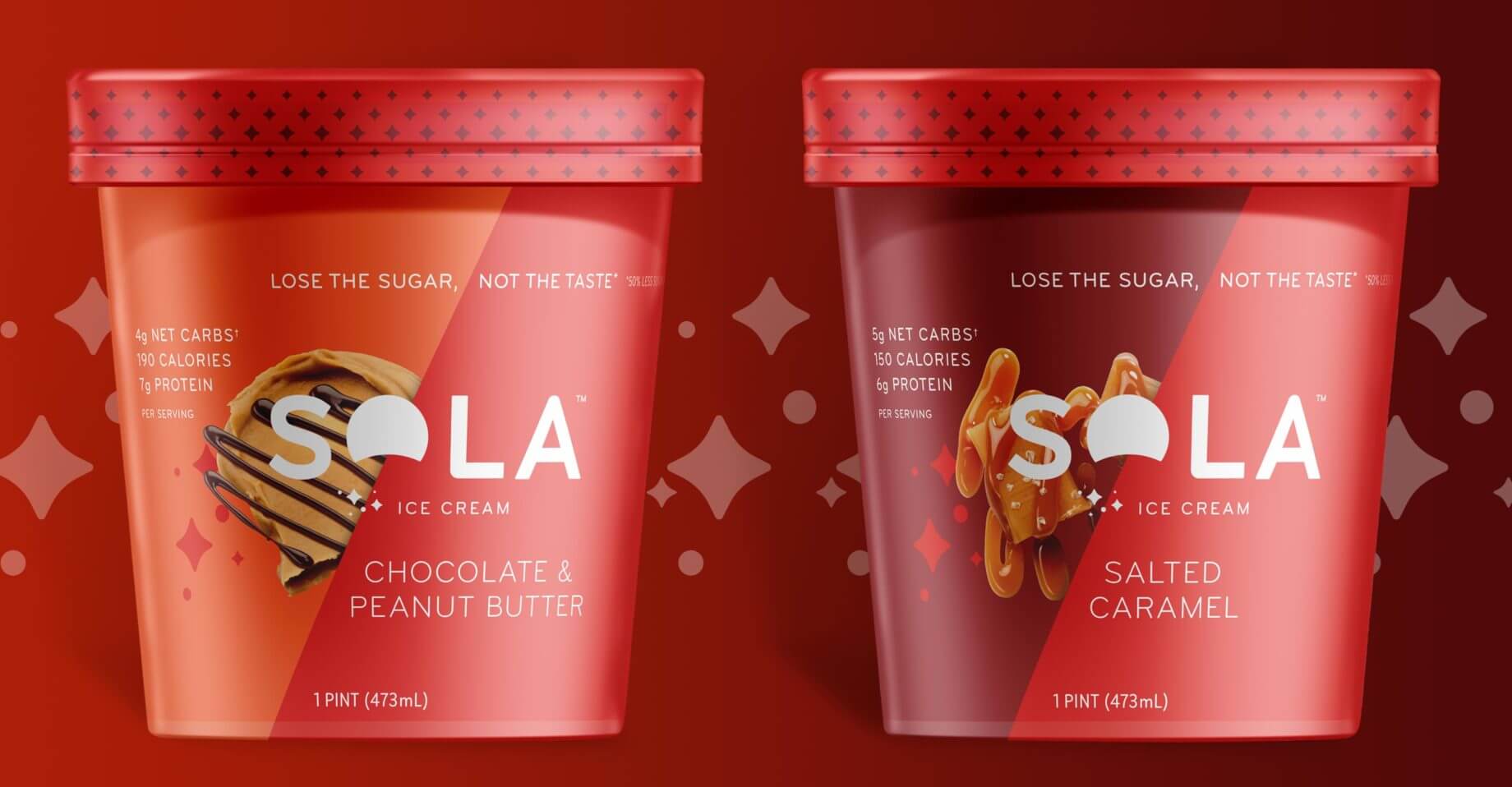
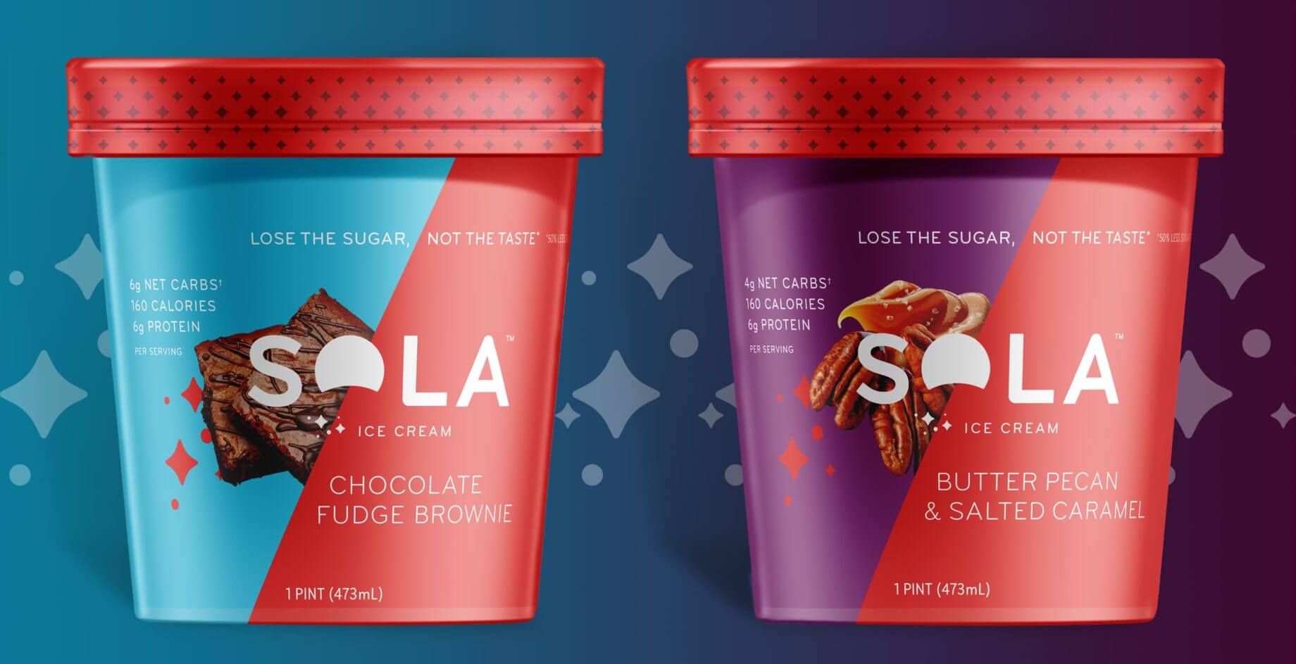
Sola — a sugar substitute made out of sweeteners found in fruits, vegetables and dairy products — looks, tastes, measures, browns and caramelizes just like sugar, but it contains 75% fewer calories and zero net carbs. Sola engaged Common Good to design the packaging for the brand, sold standalone as a sugar substitute and in a line of low-carb, low-sugar branded products.
Sola
Lose the Sugar, Not the Taste
Low-Carb, High Impact
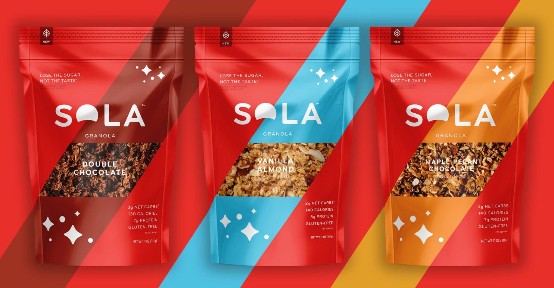
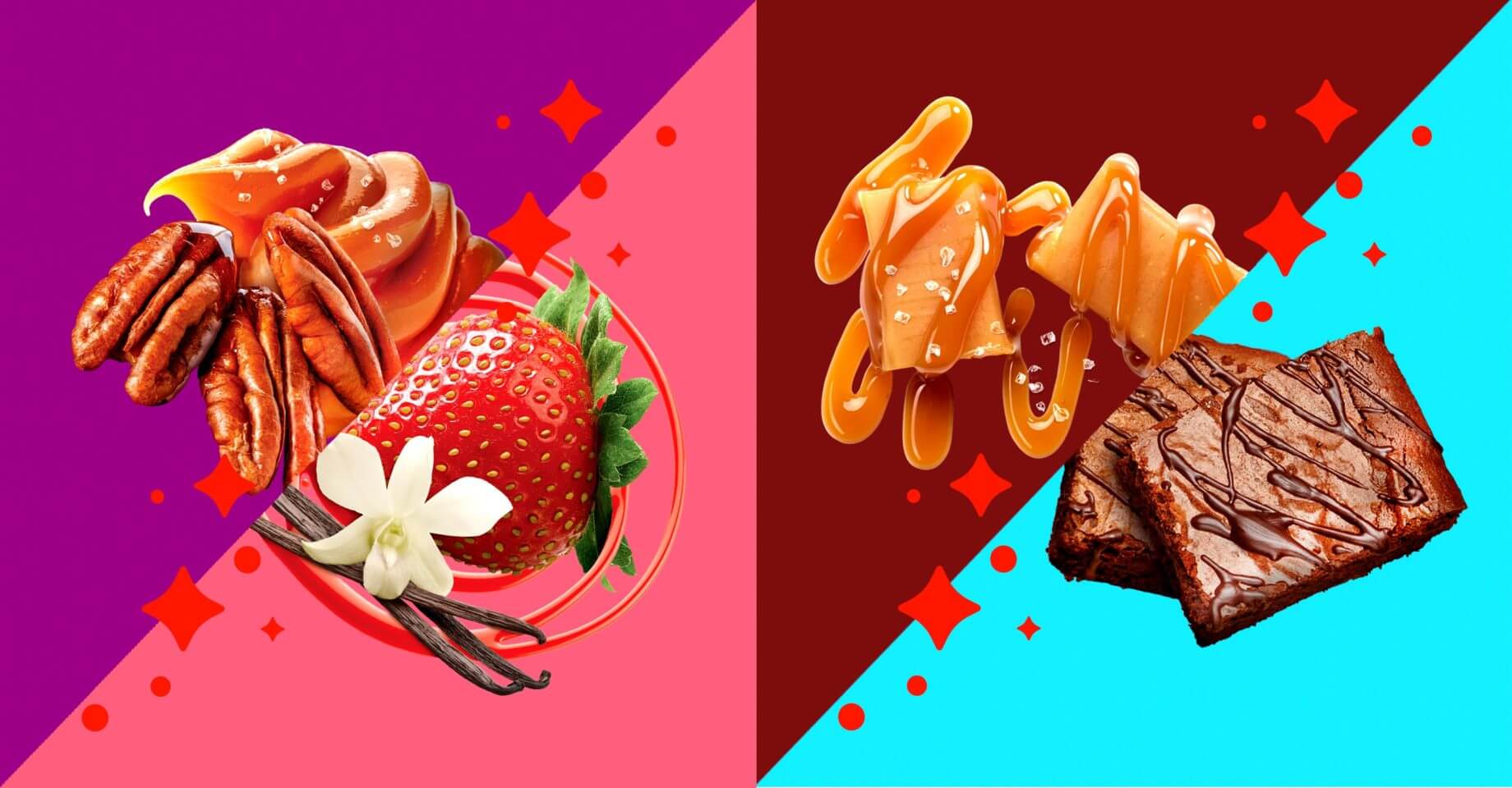
The bright red packaging is offset by a swatch of complementary color — a different hue for every SKU — and photography gives shoppers a peek at each product as if they are viewing the goods through cutaway windows. Sparse expository copy in white relays the most pertinent information on the front of each package. Sola ice cream, yogurt, smoothies, bread, granola and granola bars received eye catching treatment.
Entertain + Inform
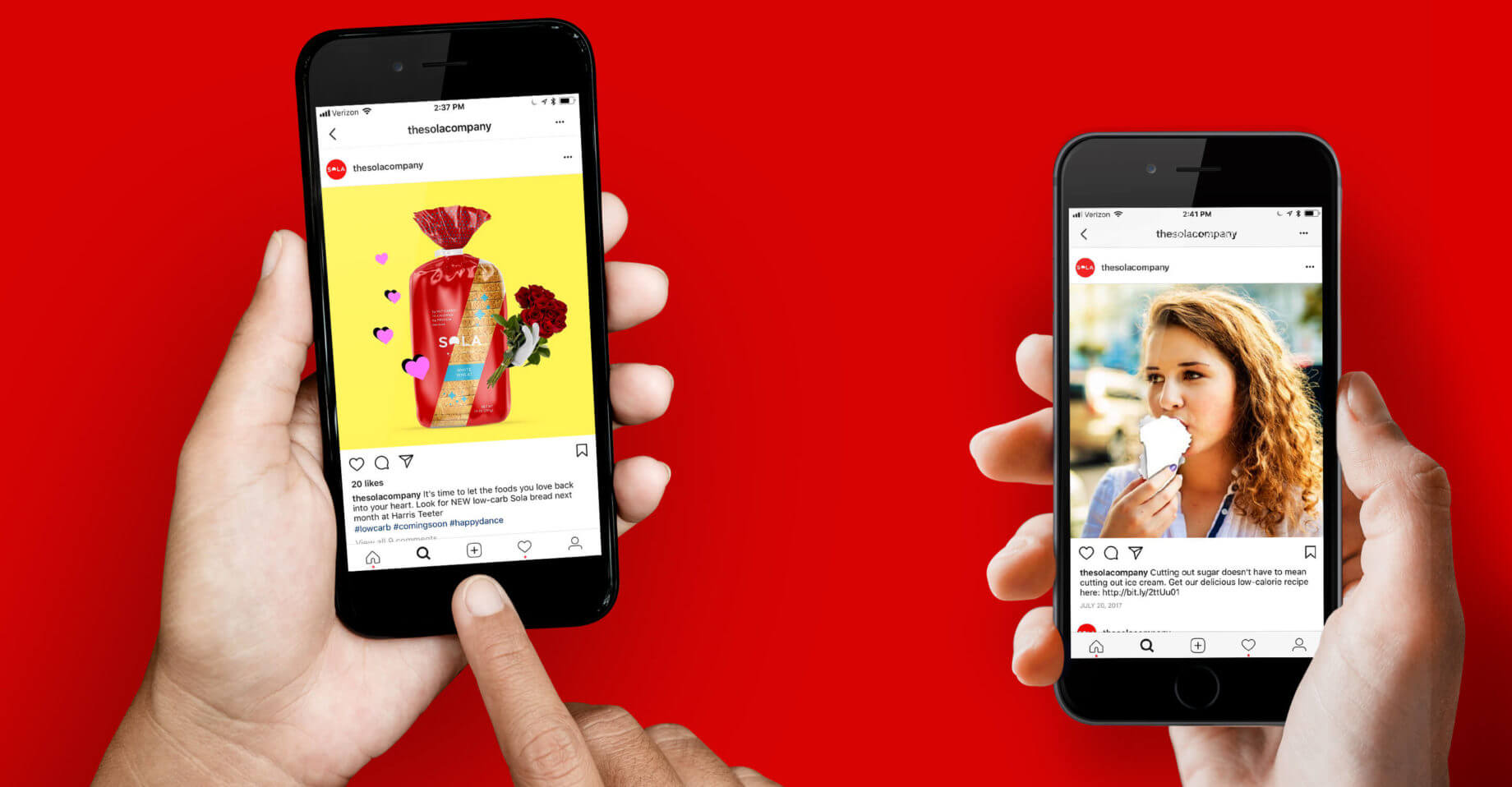
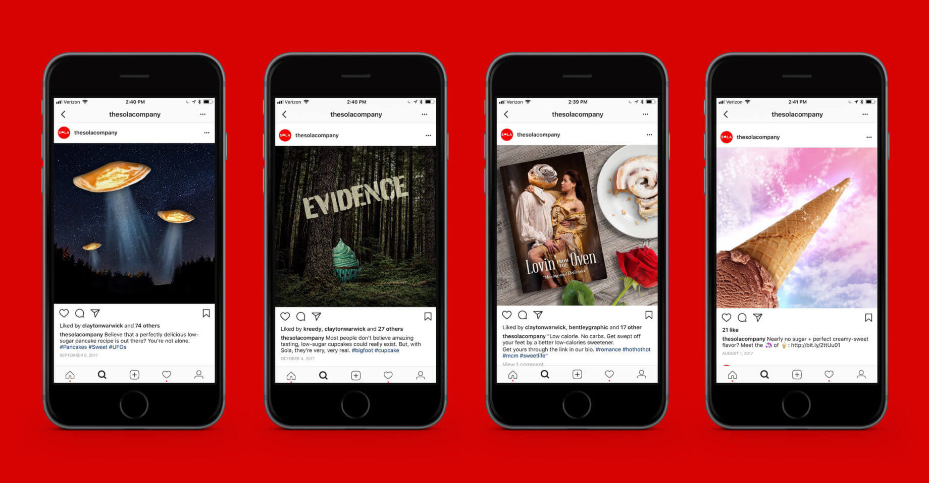
As a new product no one had ever heard of, social’s job for Sola was twofold: teach people about the benefits and endear them to the brand by talking in a way that was far away from other sweeteners.

